ค้นพบแบรนด์และเทคโนโลยีจากหน่วยธุรกิจของเรา เทคโนโลยีกาวเฮงเค็ล (Henkel Adhesive Technologies) และ แบรนด์ผู้บริโภคของเฮงเค็ล (Henkel Consumer Brands)
28 ก.ค. 2565 Düsseldorf / Germany
Henkel strengthens strategic positioning with new corporate brand identity
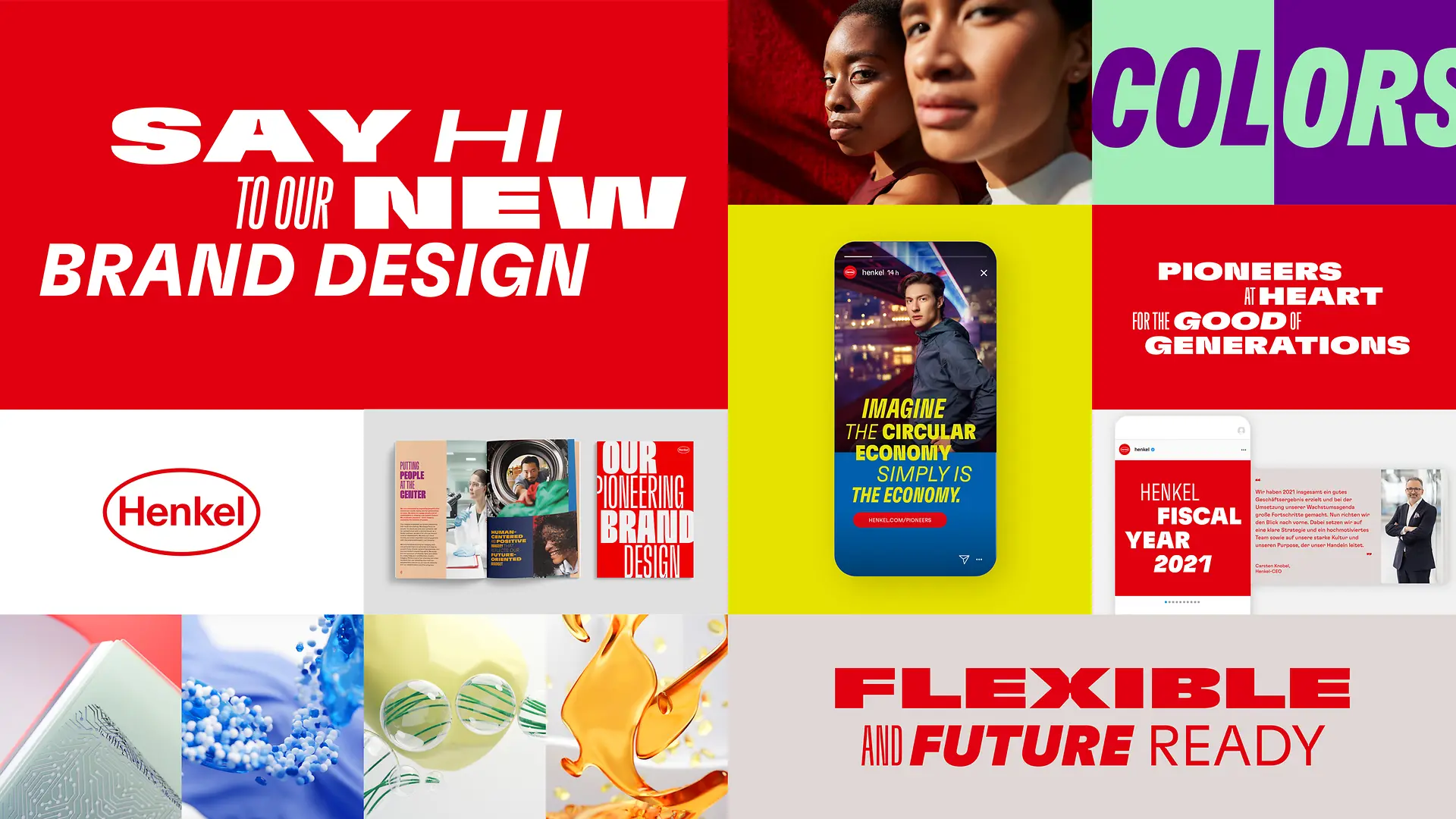
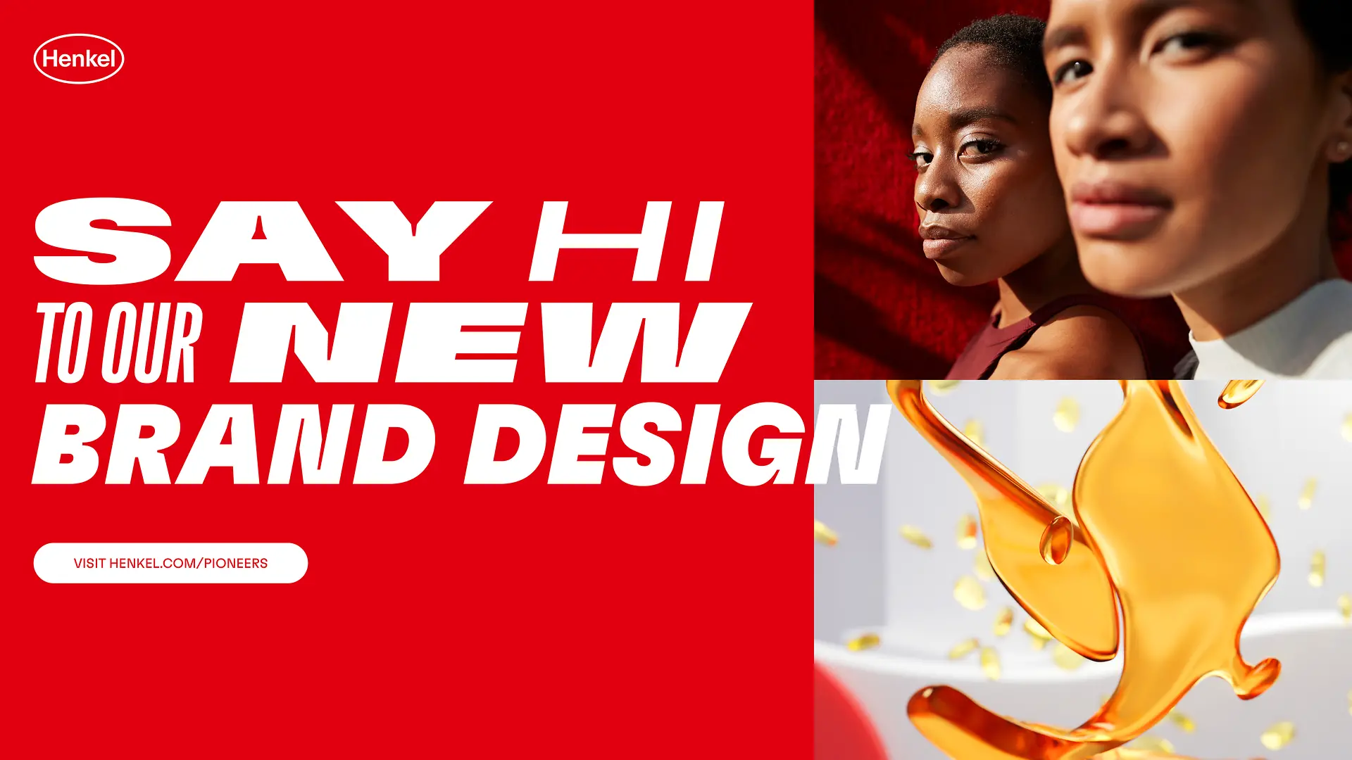
Henkel has strategically evolved and redesigned its global corporate brand identity, together with MetaDesign, the brand consultancy of Publicis Groupe Germany. Henkel strengthens the strategic positioning of the corporate brand as a pioneer with responsibility for the good of future generations expressed by a dynamic new appearance. A clear brand architecture and flexible design create a modern and consistent brand experience.
“The Henkel brand expresses who we are, what we stand for and what we do to different target groups worldwide. That’s why a strong corporate brand with global recognition is important, not only for us, but for all our stakeholders,” says Rabea Laakmann, Head of Corporate Branding & Communications Strategy at Henkel. “It creates unity, provides orientation, enables differentiation and conveys emotion.”
As a company, Henkel looks back on more than 145 years of history with strong brands and a long-standing legacy of innovation, sustainability, and responsibility. The company purpose “Pioneers at heart for the good of generations” guides the company’s transformation and sits at the heart of the new brand positioning. Henkel leads the way to reimagine and improve life every day. Today and for generations to come.
A clear framework that creates freedom
The new Henkel brand identity is being introduced worldwide since the beginning of the year. An integrated brand architecture creates a clear, binding framework for the interaction between the Henkel corporate brand, the two future business units, Adhesive Technologies and Consumer Brands, and their product brands, as well as all Henkel functions and initiatives.
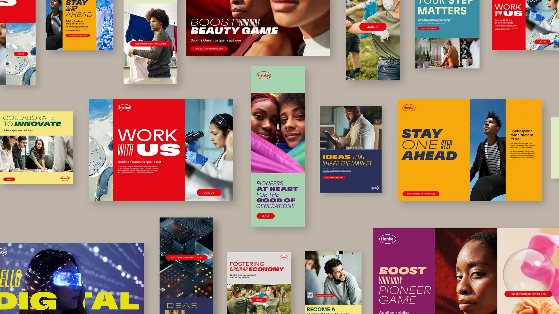
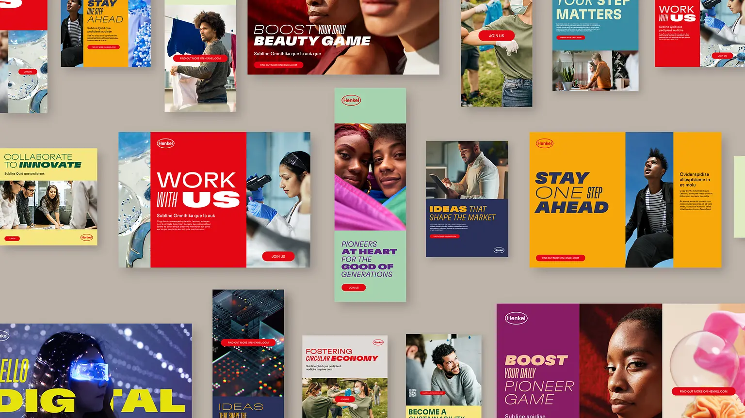
The new Henkel design combines flexibility, diversity and dynamism with simplicity and clarity. It can be flexibly adapted for any application, from digital to print to events, to meet the requirements of the various organizational units and target groups. The identity modernizes the brand without giving up what makes it recognizable: the iconic Henkel logo, which has stood for Henkel’s quality for more than 100 years, and the core colors red and white form the foundation of the design. At the same time, new color combinations bring variety and dynamism into play. An emotional and progressive visual language and a unique, variable typeface (Henkel GT Flexa) make the brand design lively and expressive.
Bringing the brand to life
A wide range of communication activities were developed for the launch of the new Henkel brand. It is important to make the Henkel brand tangible for all internal and external target groups. The new Henkel Brand Hub for the more than 52,000 employees worldwide and external partners explains the brand strategy and design and offers best practices and templates. Individual consulting and interactive brand trainings complement the global implementation. The new positioning is activated as part of a brand campaign along the strategic themes of innovation, digitization, and sustainability.
“The Henkel brand is undergoing a transformation. It has a strong heritage, purpose and culture of innovation. And now also a strong brand identity. The new design is true to the brand’s roots and supports the transformation of the company,” says Diana Brix, Managing Director of MetaDesign Düsseldorf.
“MetaDesign has supported us in developing the new brand identity with strategic vision, creative excellence in brand design and close and very good collaboration. Together, we are looking forward to leading the iconic Henkel brand further into the future,” says Rabea Laakmann, describing the successful partnership with MetaDesign.
